Ok, so I’m happy with my concept and how the design is resolving itself as to what works and what doesn’t.
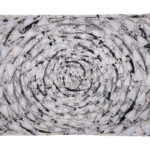
Love the dresses, love the quilting and believe the painting using black ink on the white background will be graphically energetic. This has to scream tension and turbulence.
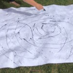
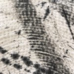
- Painting with a feather works beautifully
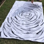
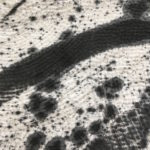
- Adding more ink using a thick brush
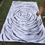
I begin working very cautiously – this has to work the first time, but as I add more marks using different tools, I relax and the marks place themselves.
- More mark making using different tools adds visual interest
- When is enough, enough?
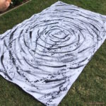
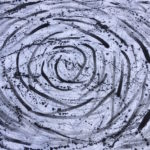
Remember the drips from the feather? Well, I began using a brush and flicking large swathes of inky black droplets over the quilt top. It was working, but another mark was needed so began dipping a bamboo stick into the ink and making numerous fast, furious, energetic, thin marks. Perfect, but it was time to step back and analyse. Was it finished? Definitely!
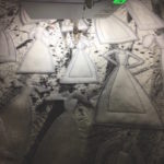
- Getting a feel for the lay out. Very happy.
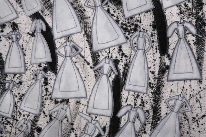
Crunch time had arrived. It’s all very well to have the concept, the dresses made, the quilt made and painted, but would they all work together to form a cohesive design which tells the story of those 193 girls?
It sure did for me. These girls have been on my mind from day one of this work and I really wanted to portray their plight in a contemporary, graphic and emotive way. I believe it does.
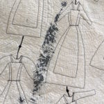
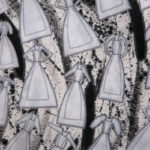
- Applying each dress using black rayon thread.
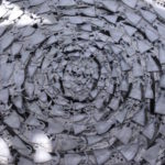
- Detail of visual texture.
Once I was happy with the balance and lay-out of the dresses, it was time to stitch them down. Using free machine stitching and a black rayon thread, they were all simply applied to the quilt.
- Love the effect of ink over quilting.
- Back of work showing ink and stitching.
The effect of the mark making over the top of the quilting created wonderful dimension. The drips, thin lines and broad brush strokes adds interest and draws the eye around and into the quilt. That’s exactly what I want with my work. I want the viewer to linger, look and think.
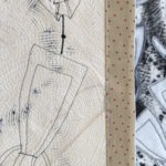
- Faced edging.
- Painted label.
A faced edging was the only option for this quilt and the label just had to be painted to emulate the front.
- Professional shot full work. Julie G Photography
I am thrilled with the finished quilt. The girls are here and visible, but they’re also other-worldly and floating through time, trying to tell their story. I see and feel the turbulence of their lives – they still have a voice!
![]()

