You know that saying, a picture’s worth a thousand words, well, that’s how I felt when I took an off-the-cuff image of a stunning Sydney coastal plant, the Gymea Lily, named by the indigenous Eora people, it also proudly denotes the suburbs of Gymea and Gymea Bay.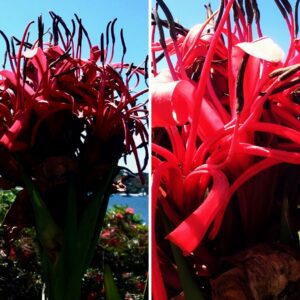
I was mesmerised by the contrasting shapes and that amazing variation of colour illuminated by a clear blue sky. Just look at those flower stamens, almost like a row of tiny soldiers in formation, stretching heaven-wards towards the sun.
The next day I had to draw. And while I attribute this design to the Gymea Lily, it’s a conceptual abstraction I’ve formed by filtering content and only selecting aspects I feel are relevant.
I’m using my visual language of shape, form, colour and line to create a composition with a degree of independence from reality – obviously not a realistic rendition of the image I took, nor is it pure abstraction.
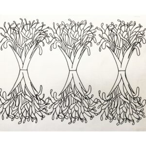
Three elements stood out to me – the sword-like leaves, the curling flower tendrils and those long and slender stamens. Look how I’ve interpreted these in my design, left. I’ve simply repeated and flipped the design, creating balance and symmetry.
I always begin with white paper, a pencil and a rubber – I work and rub-out, work and rub-out until my eye is satisfied. The process is instinctual – and nothing is wrong. Anything that doesn’t look right can be corrected, somehow. Or deleted.
I read a Facebook post about an inspiring book published in 1897 – Plants and Their Application to Ornament: A Nineteenth-Century Design Primer by Eugene Grasset. For $5.21 on Amazon.com.au, I bought an English Kindle version.
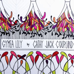 The images and the principle behind that book prompted me to replicate those ideas into my design.
‘Beautiful lines are the foundation of all beauty. In a work of art, whatever it be, apparent or hidden symmetry is the visible or secret cause of the pleasure we feel. Everything that is created must have some repetition in its parts to be understood, retained in the memory, and perceived as a whole.’ Eugene Grasset
And that’s exactly where to begin – with beautiful lines. Keep adding or subtracting and think of the following: scale, balance, variety, contrast, repetition, rhythm and pattern. I used old-fashioned tracing paper to replicate and flip the design. It’s about spending the time working with what the design has to offer. Welcome to design development.
 ‘It is no longer nature (artists) see that they represent, that they transcribe, but the nature that they aspire to see; nature more perfect and more beautiful and of which they have the interior vision.’ Eugene Grasset
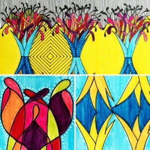
So in the top image (left) are the elements I wanted to showcase. The two smaller designs underneath use one of those elements in a pattern-inspired design. Colour obviously has a huge impact, but so too does the background patternation.
‘The art of drawing is not the art of observing forms and objects alone, it is not mere mimicry of these objects; it is the art of knowing how far and wherein, and with what just limitations, those forms and objects can be reproduced in a picture, or in a decorative work. – Eugène Grasset, 1896.’
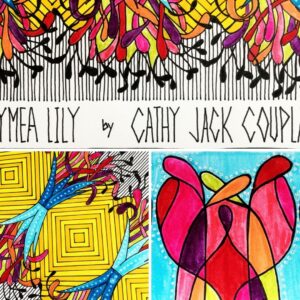 To finish can be complicated. When is too much, too much? For me, more is always better, but I have to be careful as I know I can easily over-do. Like Eugene Grasset’s book, I wanted to incorporate my design using pattern and repetition that was empathetic, didn’t overwhelm yet was eye-catching and vibrant. The lily still had to shine, but I wanted the backing-act to support and shine a little too.
It’s finished and I’m happy. It’s animated and full of life. I love working this way. Making mistakes, filling the whole page, making do and having confidence in the process.
We have some spring-flowering lavender absolutely humming with beautiful busy-bees. I’m thinking that might be next.

