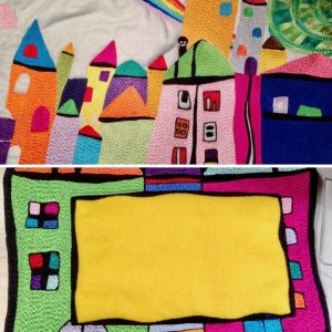
All too often it’s very easy to become entranced with the new. But for me, looking back through old ideas and design work is just as mesmerizing and often uncovers forgotten gems.
Looking through old or discarded design work with fresh eyes can be a revelation. But why does it make such a difference? It’s because sometimes you just need a break. The work has become too close and confining. Let it go – for now.
I rarely give up on a design. There’s value there, I just haven’t tapped into it yet.
Here’s a story…
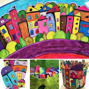
I adore the work of Hundertwasser, and years ago while visiting my daughter in Newcastle, spent the time she was at work, designing. I didn’t have access to a photocopier or anything flash, it was just me, a pencil, a rubber, scissors, glue, paper, and some markers. My original design formed the line of houses along the bottom of this much larger design, below. Many changes took place between this design and the finished work at the beginning of this post, but hey, that’s what good design’s about, isn’t it?
I feel my work is a synthesis of simplicity and intricacy.
My designs are usually simplified shapes filled using dense stitching. This design was to be no different, after all, that’s the way I like to work, that’s my style.
So I designed simplified house shapes, inspired by Hundertwasser. I looked and looked at the shapes and lines he used. He didn’t like straight lines, I took that on. He used odd little shapes within the houses and even the rooves, I took that on. I used perspective and contrast.
I remember looking at the design as it began to emerge wondering if it would ever work. But I persevered and finished a line of wildly coloured, almost fractured, houses. My daughter was positive, as always, but I was not. So I put it away.
Almost a year later, an opportunity arose to enter a themed competition. I can’t remember how I came back to that design, but I did, and I was able to weave a story around that line of houses, incorporating a number of other design elements to expand the size of the finished work to just under 100 x 100cm. That was the largest design I had ever attempted stitching. The finished work heads this post.
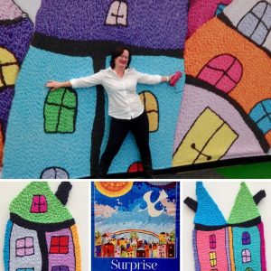
The stitching out was problematic, but I won’t go into that here. Leave it to say, I learned a lot! The image below shows the work in progress along with a quilt label, surrounded by Happy Houses, of course!

What’s the moral of this story? Well, I was fortunate to win that competition in my category. The work was also awarded Judges Choice at a Sydney Quilt Show, was used to promote the Craft and Quilt Fair on a couple of occasions and selected to be used on flyers for promotional purposes by an organization I belong to. All from a design, I wasn’t sure about. So the moral is, sometimes you just have to run with a design and have confidence in what you do.
It’s not easy, but that’s what I did.
I just had to have a photo of me in front of my Happy Houses at the Craft and Quilt Fair, below, with the flyer for the ‘Surprise’ exhibition below that!

Am I pleased I resurrected that line of houses? Of course, I am. That one design led to many, many other new design ideas.

From me to you, looking back to move forward was the best thing I ever did, and I do it often. Why not give it a go?

