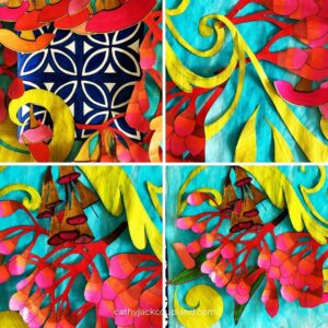
Design, for me usually means blank white paper, pencil and rubber – end of story.
But I’ve been working in a long – over 2 metre, narrow – around 40cm, format recently, and that’s large by any embroiderer’s standards.
So I decided to work differently this time and as I was painting and cutting yesterday, I couldn’t help but think of those magical black and white images of Monet with a massive pair of shears – I wouldn’t call them scissors, in hand, and copious examples of his fluid, organic style cut-outs simply stuck onto his bedroom walls.
Now that’s where the analogy between Monet and me ends, sadly. But it’s an interesting way to work – perhaps energised by the speed at which I can paint rather than colour with a marker.
The problem is that as I work I need to not only see the shapes and lines but the scale – and the scale of all those things in relation to each other and size of the work itself. Big requires big – but too big is just wrong.
The true beauty of this process is that I can play around with the placement of each element – and if something doesn’t work, I can simply remove it. No rubbing out.
I need room to move and think, and working as Monet did, cutting already coloured paper is an exquisite way to work for any creative. I still use all the old tricks of mirroring and reflecting to get the most of each shape and have used images taken during walks as inspiration for a design full of meaning.
This design revolves around the ubiquitous Australian flowering gum. They are magnificent – from buds to blossoms and fruit along with their network of stems and leaves. Ranging in colours from brilliant reds to pretty pinks and soft oranges – they are stunning when photographed against a sparkling blue sky.
 But Monet’s process works. It’s fiddly – only because my designs tend to be intensive, but I actually enjoy all that precise cutting too, oddly enough, and it’s energising to work differently – I already have an idea and some drawings ready to go for my next design.
Changing things up a little does that to you – it’s surprisingly refreshing.
Plus I seem to have a need to include pattern in my new designs, either as a border or actually within the design itself – or both – why not? You know me, more is always better.
So working differently, including gorgeous repetitive, rhythmic pattern, seems to have charged my design batteries.
How are your batteries?

