
If I hadn’t given this idea time, I’d have achieved nothing.
If I hadn’t been willing to go out on a limb, I’d have still achieved nothing.
If I hadn’t explored disparate materials to achieve textural and dimensional contrasts, I’d also have achieved nothing.
But I did achieve….and all it took was time.
Sometimes I simply need to allow a problem to niggle and gnaw. And this was one of those times.
As a visual person, I laid out my problem – my new work, on the coffee table where I could see it every moment of every day.
This included the substrate, the embroidered urchins I’ve already completed and my nearly-completed sample giving me an idea of the direction I’m heading.
My new work needs a focal point – a point of difference where the viewer’s eye can be drawn to or can simply rest and relax. The problem is, I have an absolute cacophony of stitch planned, so at this stage, I don’t really know how I’m to achieve this.
Creating this focal point is proving problematic – the piece is going to be so busy to start with. How do I make it different?
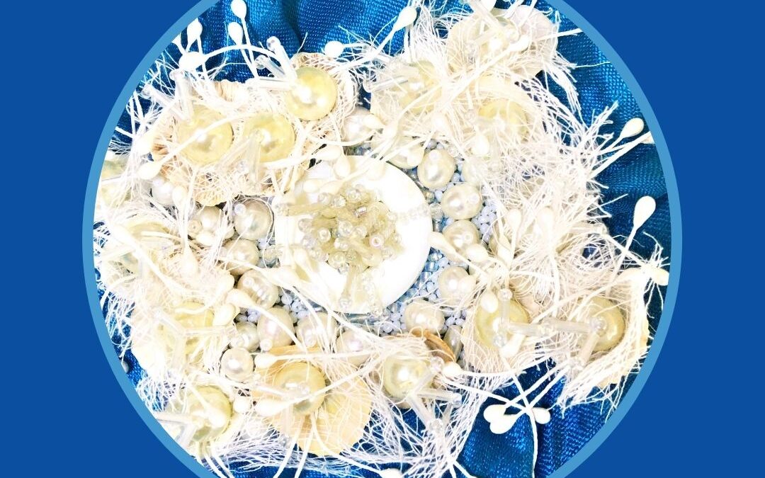
My only option was to take away colour – that is, make it white. It will be surrounded by colours and textures, so I think this’s my only option.
Now as someone with a passion for colour, you’d think white would be a no-go zone for me. Not so. I adore white on white, but it must include contrasts of textures, shapes and lines that capture visual interest. Worked correctly, white is elegant and very appealing.
So my recipe begins with time……then I gave it more time…..and if you’d like to see my process, check out my latest Textile Zen vlog – A Cacophony of Stitch.
Like a good sourdough starter, ideas eventually start to bubble and brew – till I have to get my hands right into that mix of ingredients to see what permutations of opportunity I can come up with.
And that’s what happened yesterday.
I’m extremely pleased with the results on so many levels. Yes, It’s all white, and as this is my interpretation of a seascape, I wanted it to look weirdly, but enticingly and beautifully eerie as seascapes sometimes do.
To achieve that look, I’ve incorporated a number of disparate materials that unbelievably worked well together, creating beautiful contrasts of shapes, lines and textures. These include shells with their tops open, sourced locally, very loosely woven cotton muslin, fake pearls, bugle beads, round beads, shell rings, small shells I think I must have bought a long time ago and the piece de resistance, white embellishments with seed-like endings I also bought years ago – never knowing what I’d do with them. They were perfect here.
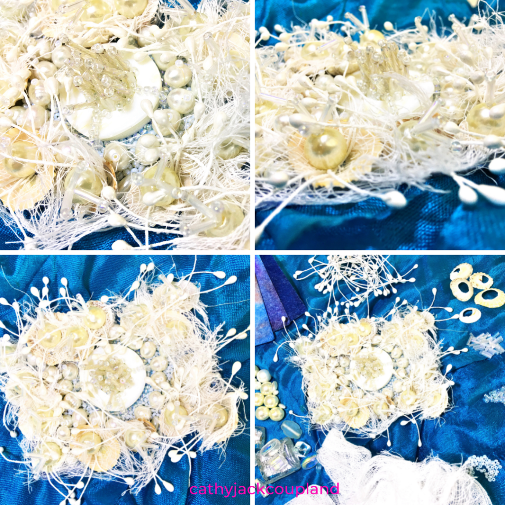
A trip to the Embroiderer’s Guild of NSW for thread supplies also furnished me with a product I’ve used before and forgotten about. It was simply labelled as ‘trading cards’ but is, I think, a mixture of cotton fibres and paper. Either way, it performs very well as a base or slip to stitch into, especially as shells and large pearl beads can be quite weighty – and as this was just an idea, it was an ideal size to work on too.
If it worked, I could simply apply it to the ground fabric of the work. If it didn’t work, I have another sample for my design journal.
My ingredients came together beautifully and rose to the challenges I gave them.
In its all-white beauty, light is either reflected or absorbed. Shells become a cacoon-like repository, gently housing those wonderful fake pearls, creating something that looks exactly as I wanted – weirdly, and wonderfully, sea-scape-ish.
I’m simply the baker, the mixer of ideas and the one willing to spend that precious time trying to discover a way forward, with the ingredients I have at hand.
I could so see this embroidery on a hat!