
Monochrome: a photograph, picture or design executed in black and white or varying tones of only one colour.
This would be one of my favourite colour schemes.
It’s so easy to use and creates huge visual interest if used correctly.
One colour – it’s a no-brainer.
But the secret is to incorporate that one colour along with its tonal and close colour relatives because if you don’t the colour scheme will fall flat, lacking that much-needed visual interest.
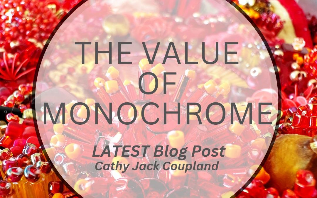
The work below is the second piece of recently found treasure resurfacing from a work-room tidy-up.
I have taken some liberties, so it’s not a true monochromatic colour scheme, but it works for me.
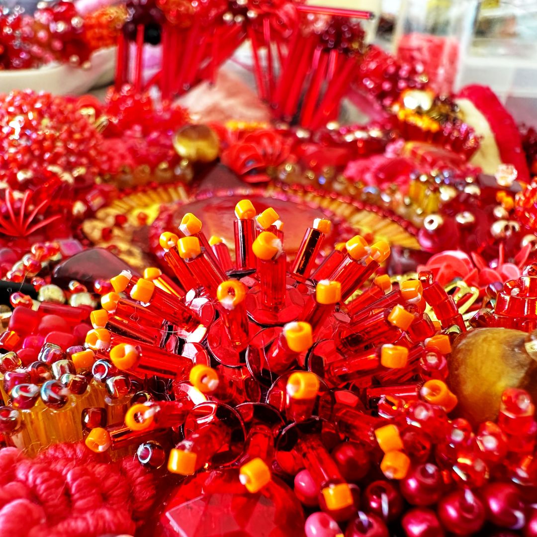
Orange and a peachy pink add tonal variation, with small amounts of gold, soft browns and even some yellow bugle beads working together beautifully.
What works extremely well here is the embroidery in terms of colour and texture. It softens and contrasts so well with the hard shininess of all those beads.
But again there’s that powerhouse, contrast doing a lot of the heavy lifting.
There’s shiny/matte, tall/short, large/small, and few/many. Add colour, and the whole thing pops.
So a monochromatic colour scheme is one I’ll always have at the back of my mind when designing new work – and how it evolves depends on the materials I have available.
Working within a fairly limited colour palette for me means picking up bags of pink, red, orange and gold beads and thread.
It’s hard to say no when they’re sitting in front of you, begging to be used.
Working within tonal ranges of one colour makes for some stunningly elegant work.

All views and opinions expressed are my own, except where acknowledged information is included from other sources.