

Having trouble deciding on a colour palette for a new piece of work?
Why not try a monochromatic colour scheme?
It’s so easy, yet packs a real punch when put together correctly.
In fact, I think monochromatic colour schemes rate amongst my favourite.
So, how do you knock it out of the park simply using one colour?
Easy-peasy.
Choose your primary colour – and if you need to have an old-fashioned colour wheel in front of you.
Now simply choose colours from your stash of threads, beads, sequins, fabrics and other embellishments that work in with the following:
- begin with a selection of your primary colour
- now include colours on either side of your primary colour on the colour wheel – for example, if you chose green, then make sure to include yellow greens and blue greens too
- and within all those colours, make sure to use a range of values or tones from light to medium and through to dark, dark, dark – that’s where the magic lies
- and although this has nothing to do with colour, I also advise using texture to add that extra visual interest
- use a variety of shiny and matt, thick and thin, big and small to give even more appeal – so use contrast too
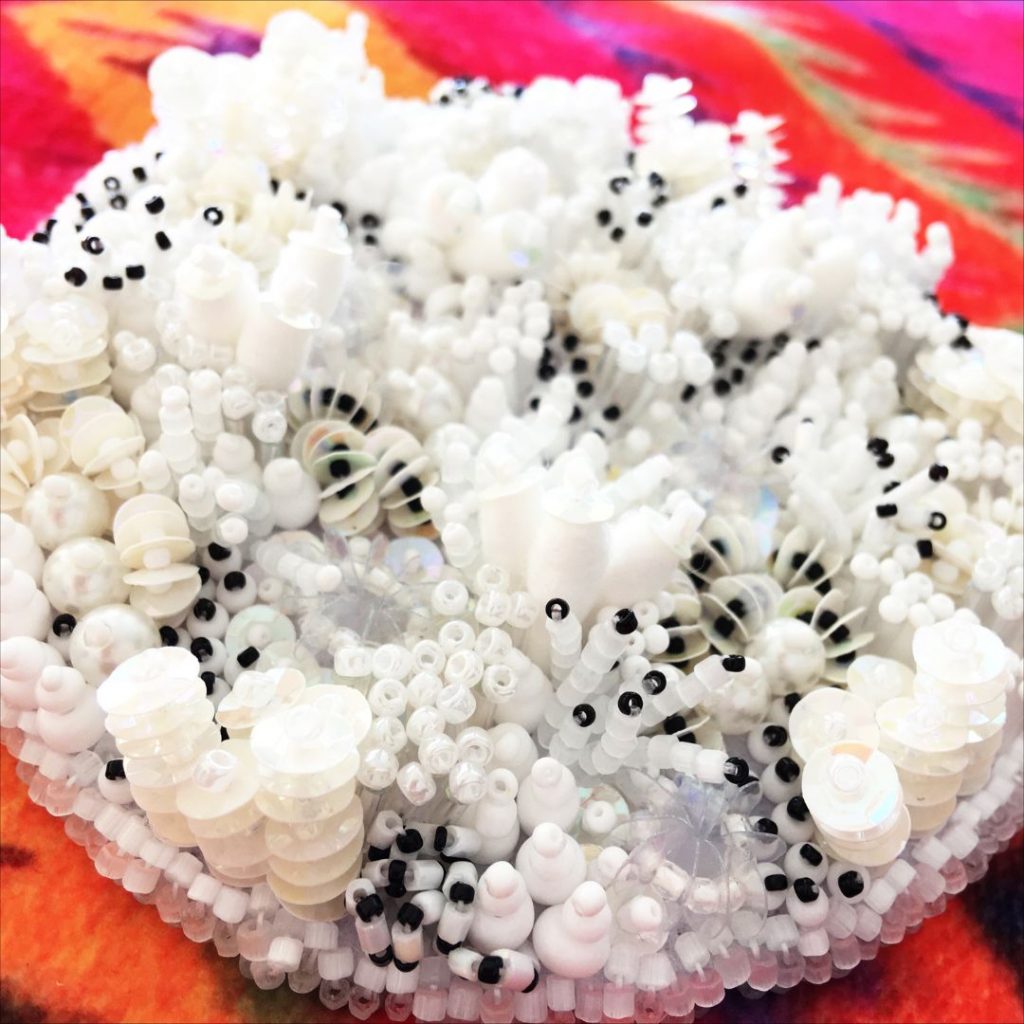
Sometimes, I do include black – and as black is not considered a colour, technically, I feel fine including it in my monochromatic work.
Black adds that full stop, that end note that grounds, gives depth and unifies the work.
See for yourself. Make a sample including black, then make another without. Which do you prefer?
And it doesn’t matter the technique used, whether it’s surface stitchery, beading, applique or patchwork, this colour scheme can be a knock-out when worked correctly.
Just remember to be inclusive of your primary colour’s best friend’s either side of it, and invite them to the party as well, ensuring you also use a range of values or tones from light to dark.
The greater the value range, the more striking your work will be.
And when working with either a black or white palette, the same applies. No two blacks or whites are alike, so use yellow whites, blue whites, blue blacks and grey blacks, and use those contrasts to make it pop.
So, for me, a monochromatic colour scheme is sassy, reliable, and really easy to use.
Why not give it a go?