Design is a narrative. It’s storytelling incorporating the Elements and Principles of Design in uniquely individual and original ways, reflecting my interests and passions.
Vision Boards are a playground for those ideas to coalesce and develop. Think of your Creative Journal, but on one page on one concept and where all the information is easily seen at one time. It’s a beginning, an embryo for my passions and where my crazy ‘what if’ ideas have a chance to meet and say hi, can we hook up? We might be onto something here.
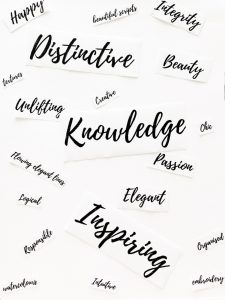
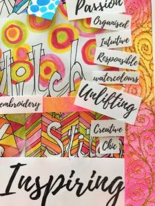
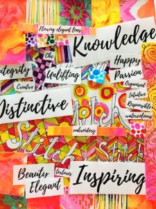
Vision Board: A form of collage incorporating images, text and samples based on a topic or theme evoking or projecting a style or concept.
Like Mind Maps, this is a chance for me to throw everything and anything into the mix. If it doesn’t work, I can just take it off. I’m constantly surprised at the freedom this all-in method allows me for new design development. The artistic textile creative may find this method of designing invaluable. It’s the genesis for the visual language needed to tell the story of my ideas before I even begin to draw up a design or take a stitch.
I can look at a new design at odd times and see different things each time – and that’s a good thing as I need that time to consider, reflect, edit and perfect.
I recently undertook a website refresh. I wanted it to be a reflection of me and my values, as well as to inspire and motivate new work, for me and others. So I asked myself a couple of questions:
What did I want to communicate and what look was I going for? I used a Vision Board to respond to both questions visually.


In answer to the first question, I used words to describe what I wanted to communicate. For the second, I wanted to inject my personality; a sense of friendliness and warmth using uplifting colour and design. I wanted the text to be more freeform and personable yet while adding more colour I had to keep that feeling of white space so necessary in good web design.
Other platforms including my Pinterest Boards reflect the fonts used here. I don’t want to see another font in a while, I can tell you.

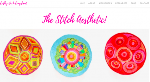
I’m thrilled with the outcome. Above is my Home page. The first thing you see is colour, then the beautiful script in pink. I love the header and footer banners used on the other pages, which I painted, and which reflect the colour palette I was looking for.
From me to you, give a Vision Board a go and see where it leads you. I have two great Pinterest Boards which offer ideas and information. Vision Board Inspiration – ideas and styling. Vision Board Unusual Layout – interesting ways to showcase ideas.
Also, if you’d like to receive regular updates, please sign up below.
I have to give a huge shout-out to Jess Jones who helped me along this whole tech process. Thanks Jess!

