A lot.
One word has the ability to fire our imagination – a few words can open our minds to a world of possibilities.
But I want to talk about colour words – words that immediately give us an emotional response to colour and perhaps how we can use colour in our work.
We all know that colour is powerful, emotive and eye-catching – but it can be a difficult mistress.
So when you’re battling to find colour inspiration, why not just use words?
This idea came to me as I was writing a teaching plan for a new embroidery workshop – and I’m the worst workshop attendee because I want to have every option available which means I pack everything.
The idea was to try to control that for students so that they could focus on just one colourway and pack accordingly – and perhaps purchase new threads as one is want to do…
So let’s jump straight into descriptive words that could promote an entire colour palette for new work – or one that could at least begin a new creative journey:
- Alabaster – dreamy hues of white and creamy white tones, milky, chalky, snowy – rich, elegant and extremely sophisticated
- Amber – yellowy, golden, caramel to burnt browns – decadent, luxurious and earthy
- Apricot – golden yellows tinged with luscious layers of pink – fresh, pretty and youthful
- Azure – from sky blues to ultramarine and deep, dark blues – moody, watery and calming
- Burgundy – warm shades of brownish/purplish reds, ruby, berry – deep, dark and oh so mysterious
- Canary – bouncy light to moderate yellows – bright, young and uplifting
- Chartreuse – yellow-green – exotic, sophisticated and eye-catching
- Ebony – dark, rich tones of black – avant-garde, complex and sensuous
- Roseate – pink, pink and pinker, uplifting, daring and eye-popping
- Saffron – deliciously yellowy-orange – bright, fresh and energetic
- Vermillion – orangy red tones – brilliant, romantic and seductive
Then think about these types of words that also help describe colour:
- Ablaze
- Bleached
- Bold
- Clean
- Dappled
- Electric
- Fiery
- Flamboyant
- Fluorescent
- Glittering
- Jazzy
- Opalescent
- Restrained
- Rich
- Vivid
- Watery
So when you have a design idea, think about the power of a few simple words, sentences or paragraphs to help you nail a purposeful and supportive colour palette for your narrative.
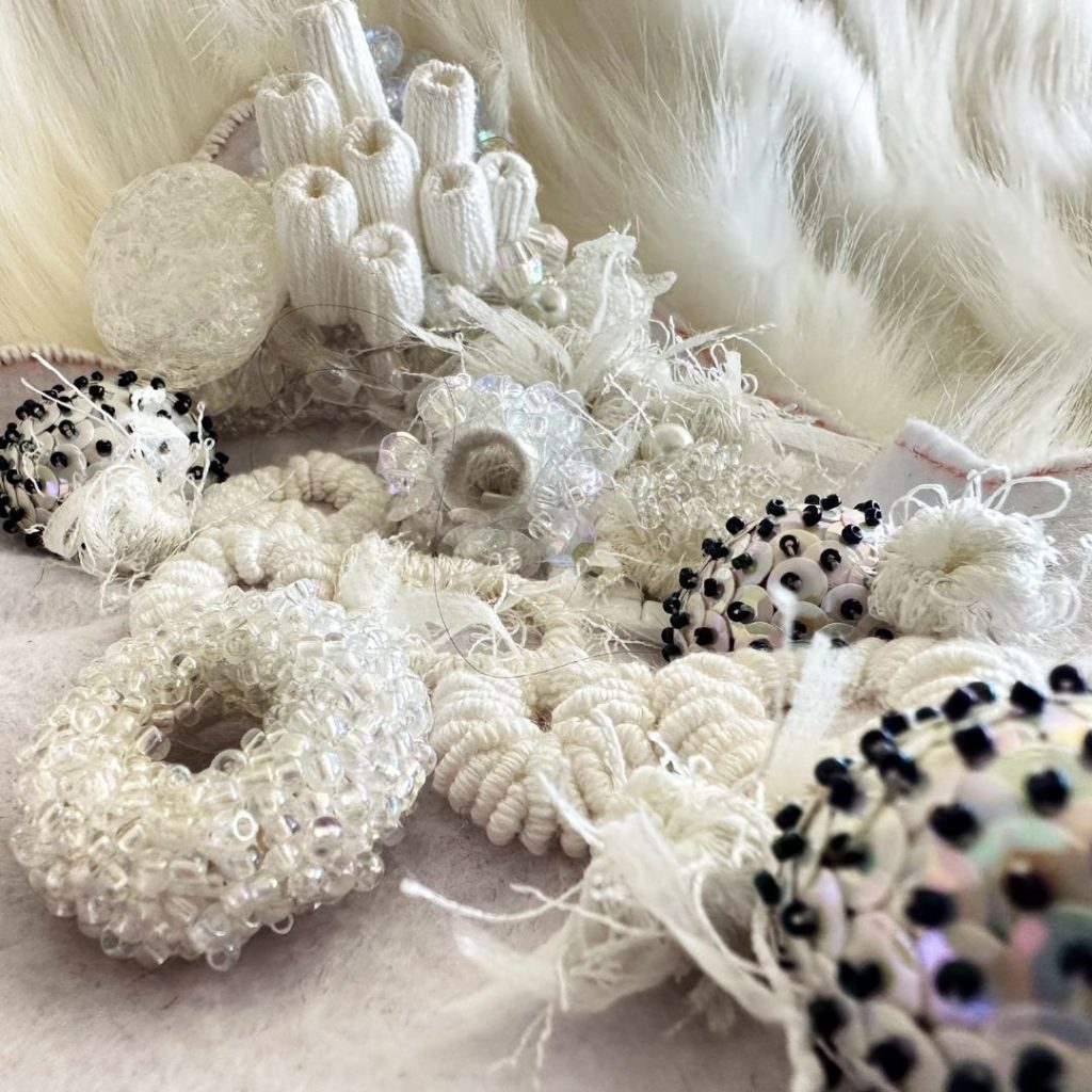
For instance, I’m currently working on another white embroidery describing coral bleaching – how would I describe the colour palette I want/need to use?

- Watery
- Icy
- Milky
- Bleached
- Pearly
- Clear
- Ivory
- Silvery
- Wintery
And while most European connotations associated with white reference innocence and purity – in this case, the meaning is just the opposite – it means death and eventual decay.
But I still want to make it beautiful, because, in an odd way, it is, and perhaps these embroideries may bring further light to this global concern.
So what’s in a word?
The power of your imagination.

All views and opinions expressed are my own, except where acknowledged information is included from other sources.

